Creating a Hugo Theme - Part 4: List Layout

In this post, we’ll improve the list.html file. Here’s how it currently looks—completely unstyled:
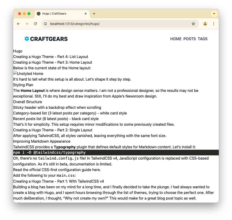
Styling Plan #
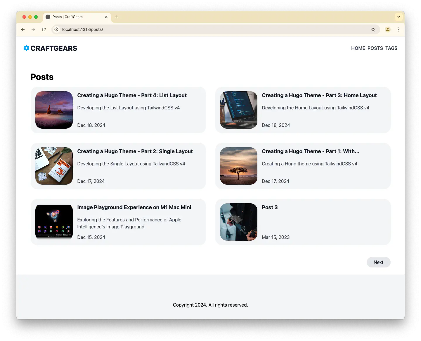
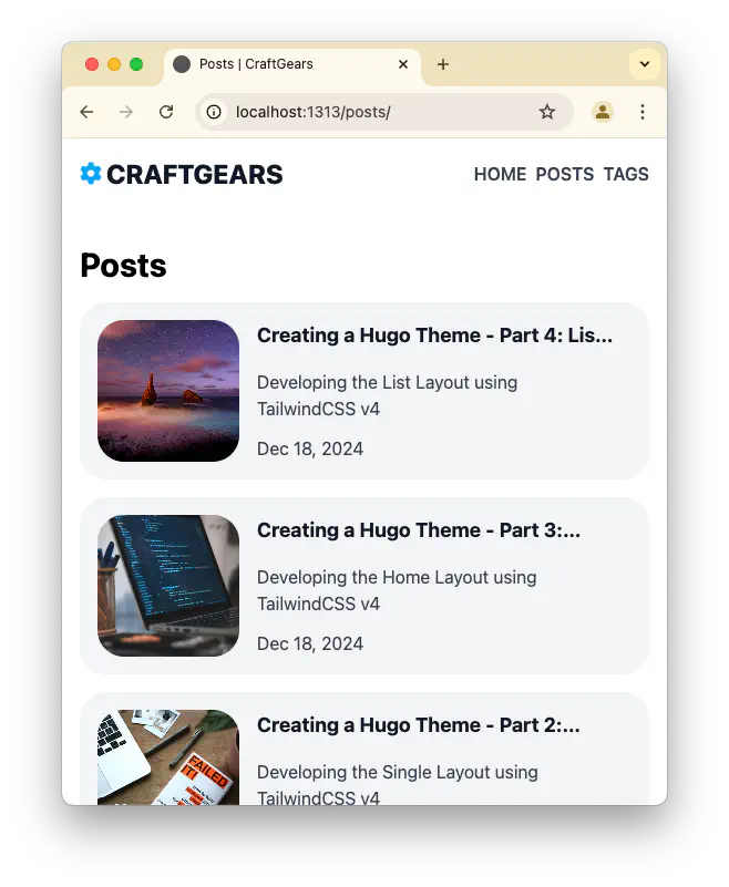
The plan is to display the list of posts in two columns. On the left, there will be a simple thumbnail, and on the right, the title and description. Each page will show ten posts with pagination available.
Here’s how the finished layout looks. (For demonstration, the page is set to display six posts due to limited content.)
list.html #
While list.html can include posts, tags, and more, we’ll focus here solely on styling the post list. Tags are handled separately since they don’t have images.
This file also naturally integrates with the “More” button on the homepage, enabling seamless navigation.
{{ define "main" }}
  <div class="flex flex-col md:max-w-7xl mx-auto w-full p-4 md:p-6">
    <h2 class="text-3xl font-bold py-4">{{ .Title | humanize }}</h2>

    <div class="grid grid-cols-1 lg:grid-cols-2 gap-4 lg:gap-8">
      {{ range ( .Paginator 6 ).Pages }}
        {{- partial "content/slim-card.html" . -}}
      {{ end }}
    </div>

    <div class="flex items-center mt-10">
      {{- if .Paginator.HasPrev -}}
      <a class="text-dark1-color bg-gray-200 hover:bg-gray-300 rounded-full py-1 md:py-1.5 mr-auto md:py-1.5 px-4 md:px-6 duration-300"
          href="{{ .Paginator.Prev.URL }}">Previous</a>
      {{- end -}}

      {{- if .Paginator.HasNext -}}
      <a class="text-dark1-color bg-gray-200 hover:bg-gray-300 rounded-full py-1 md:py-1.5 ml-auto md:py-1.5 px-4 md:px-6 duration-300"
          href="{{ .Paginator.Next.URL }}">Next</a>
      {{- end -}}
    </div>
  </div>
{{ end }}
The implementation is straightforward, and the individual cards are handled by the slim-card.html partial.
slim-card.html #
This card design is simpler than the homepage. It features an image on the left and the description on the right.
<a href="{{ .Permalink }}">
  <article class="relative flex group rounded-3xl duration-300 bg-gray-100 h-40 p-4">
    {{- if .Params.image }}
      {{- if (strings.HasPrefix .Params.image "http") }}
        <img
          class="rounded-3xl aspect-square object-cover group-hover:scale-105 duration-300"
          src="{{ .Params.image }}"
          alt="{{ $.Name }}">
      {{- else }}
        {{- with $coverImage := .Resources.Get .Params.image -}}
          {{- $coverImage := $coverImage.Process "resize 700x" -}}
          <img
            class="rounded-3xl aspect-square object-cover group-hover:scale-105 duration-300"
            src="{{ $coverImage.Permalink }}"
            alt="{{ $.Name }}">
        {{- end }}
      {{- end }}
    {{- end }}
    <div class="flex flex-col px-4">
      <h3 class="mb-4 text-dark1-color text-lg font-bold line-clamp-1">{{ .LinkTitle }}</h3>
      <p class="flex-1 mb-4 text-dark2-color text-normal leading-normal line-clamp-2">{{ .Params.description }}</p>
      {{ $dateMachine := .Date | time.Format "2006-01-02T15:04:05-07:00" }}
      {{ $dateHuman := .Date | time.Format ":date_long" }}
      <time class="text-dark3-color" datetime="{{ $dateMachine }}">{{ $dateHuman }}</time>
    </div>
  </article>
</a>
terms.html #
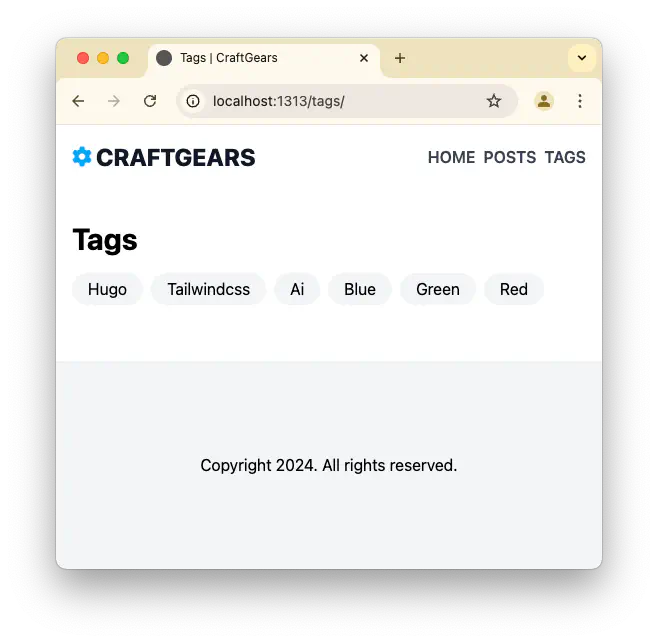
Tags and categories are processed in the terms.html file. This is a general-purpose template as it handles the final lookup stage in Hugo’s rendering pipeline.
For a detailed customization guide, refer to the official documentation: Hugo Taxonomy Templates
{{ define "main" }}
  <div class="flex flex-col md:max-w-7xl mx-auto w-full p-4 md:p-6">
    <h2 class="text-3xl font-bold py-4">{{ .Title | humanize }}</h2>

    <div class="flex flex-wrap gap-2 pb-10">
      {{ range .Pages }}
        <a class="px-4 py-1 md:py-1.5 rounded-full bg-gray-100 hover:bg-gray-200 duration-300" href="{{ .RelPermalink }}">
          {{ .LinkTitle }}
        </a>
      {{ end }}
    </div>
  </div>
{{ end }}
Conclusion #
The basic structure of the site is now in place. Only the header and footer remain. For the header, adding a folding feature for mobile would be ideal.
We’ll tackle that in the next installment.
