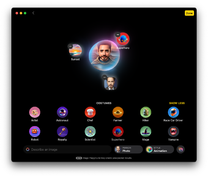
Creating a Hugo Theme - Part 2: Single Layout

After applying TailwindCSS, all styles vanished, leaving everything with the same font size.
Improving Markdown Appearance #
TailwindCSS provides a Typography plugin that defines default styles for Markdown content. Let’s install it:
npm i -D @tailwindcss/typography
Oh, there’s no tailwind.config.js file! In TailwindCSS v4, JavaScript configuration is replaced with CSS-based configuration. As it’s still in beta, documentation is limited.
Add the following to your main.css:
@plugin "@tailwindcss/typography";
This plugin alone will make Markdown content much easier on the eyes.
Now, edit the file themes/<theme-name>/layouts/_default/single.html to include the prose class, applying it from the title to the content before the terms.
{{ define "main" }}
  <article class="prose">
    <h1>{{ .Title }}</h1>

    {{ $dateMachine := .Date | time.Format "2006-01-02T15:04:05-07:00" }}
    {{ $dateHuman := .Date | time.Format ":date_long" }}
    <time datetime="{{ $dateMachine }}">{{ $dateHuman }}</time>

      {{ .Content }}
  </article>

    {{ partial "terms.html" (dict "taxonomy" "tags" "page" .) }}
{{ end }}
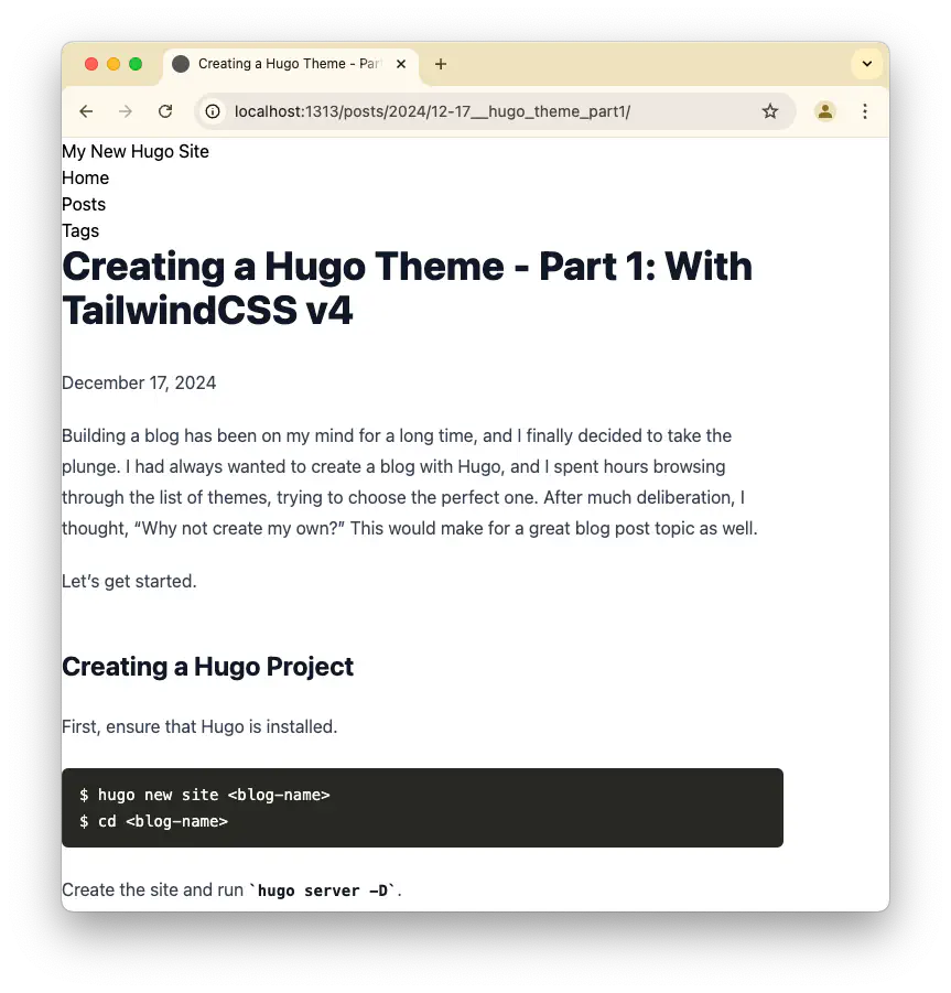
The content now looks much better. It’s a good start, and I’ll refine it further later.
Building the Header #
TailwindCSS promotes Mobile First development. It makes sense, though it’s not always intuitive to start that way. Let’s try: switch Chrome to mobile mode and begin.
Edit themes/<theme-name>/layouts/partials/header.html:
<div class="flex items-center justify-between py-4">
  <a href="/">
    <span class="uppercase text-2xl font-extrabold">{{ site.Title }}</span>
  </a>
  {{ partial "menu.html" (dict "menuID" "main" "page" .) }}
</div>
Update themes/<theme-name>/layouts/partials/menu.html. For now, just add a class to the ul tag:
...
{{- with index site.Menus $menuID }}
  <nav>
    <ul class="flex gap-x-2">
      {{- partial "inline/menu/walk.html" (dict "page" $page "menuEntries" .) }}
    </ul>
  </nav>
{{- end }}
...
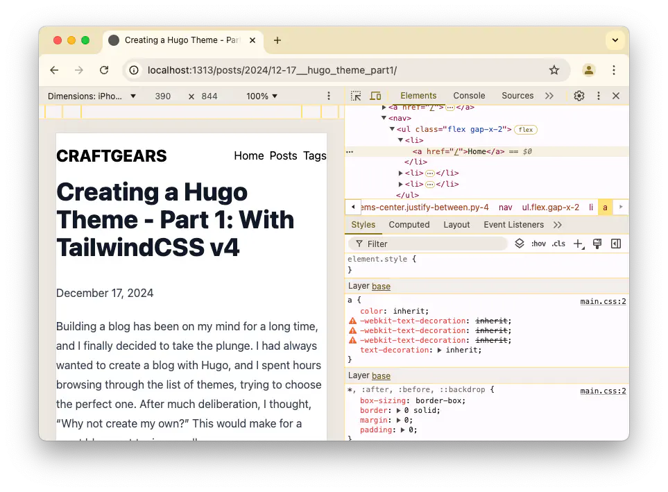
Hugo Modules: Adding an Icon Font #
I want to display a gear icon next to the site title. Since I can’t draw, I’ll use Font Awesome. Hugo Modules provide Font Awesome integration, though setting it up isn’t straightforward.
Follow the documentation here.
First, modify hugo.toml for environment-specific configurations:
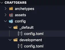
Add _default/module.toml and include the Font Awesome module:
[[imports]]
path = "github.com/gethugothemes/hugo-modules/icons/font-awesome"
Save the file and you’ll encounter an error:
ERROR Failed to reload config: failed to load modules: module "github.com/gethugothemes/hugo-modules/icons/font-awesome" not found...
To fix this, initialize Hugo Modules:
$ hugo mod init craftgears

go: creating new go.mod: module craftgears
hugo: to add module requirements and sums:
        hugo mod tidy
Now, the error disappears.
Add the following to config.toml:
# For brands
[[params.plugins.css]]
link = "plugins/font-awesome/v6/brands.css"
# Load all icons except brands
[[params.plugins.css]]
link = "plugins/font-awesome/v6/icons.css"
# Regular icons font family
[[params.plugins.css]]
link = "plugins/font-awesome/v6/regular.css"
# Solid icons font family
[[params.plugins.css]]
link = "plugins/font-awesome/v6/solid.css"
Update the header partial to include the gear icon:
<div class="flex items-center justify-between py-4">
  <a class="flex items-center gap-x-1" href="/">
    <i class="fa-solid fa-gear text-sky-500"></i>
    <span class="uppercase text-2xl font-extrabold">{{ site.Title }}</span>
  </a>
  {{ partial "menu.html" (dict "menuID" "main" "page" .) }}
</div>
However, the icon doesn’t show up. The params.plugins.css settings didn’t inject styles into the <head> tag.
To resolve this, use custom logic inspired by the Hugoplate theme. Update themes/<theme-name>/layouts/partials/head/css.html:
<!-- plugins + stylesheet -->
{{ $styles := slice }}
{{ range site.Params.plugins.css }}
  <link crossorigin="anonymous" media="all" rel="stylesheet" href="{{ .link | relURL }}" />
{{ end }}

{{ with resources.Get "css/main.css" }}
  <link rel="stylesheet" href="{{ .RelPermalink }}">
{{ end }}
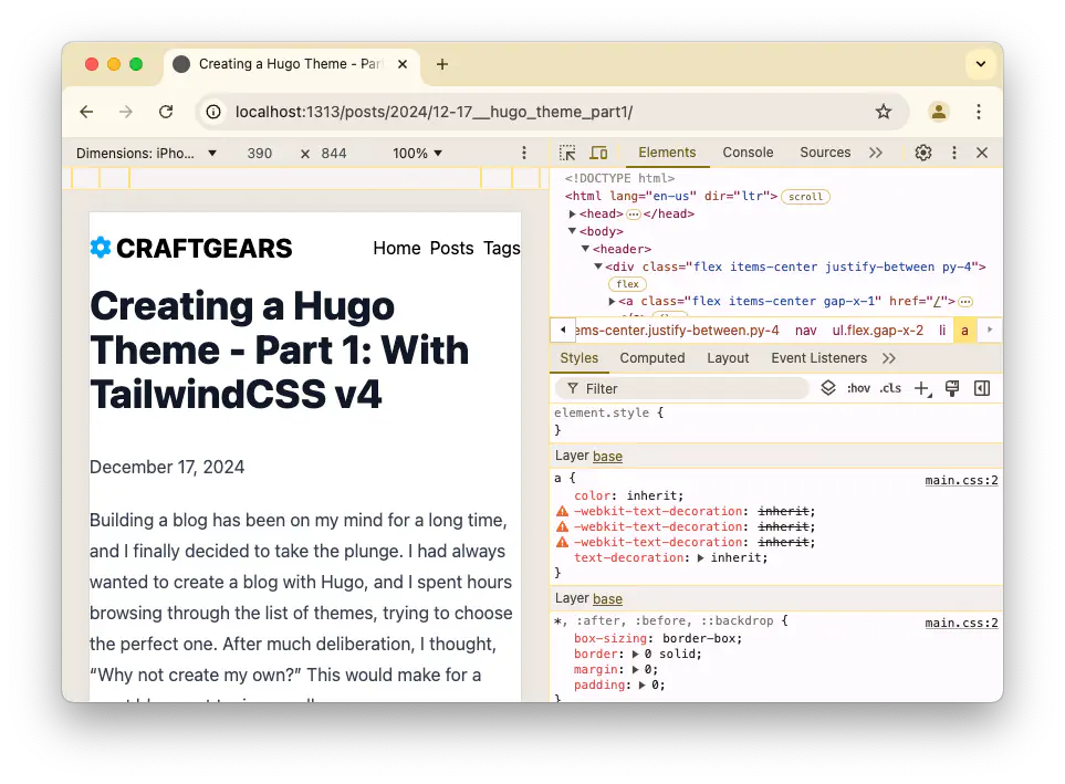
The gear icon is now visible. A similar approach would be needed for params.plugins.js, but I’ll handle that later.
Responsive Design #
Currently, the content leans to the left on large screens because prose has a default width of 65ch. I want a center-aligned layout with a maximum width for both the header and content.
Before diving into the code, let’s take a look at the final result.
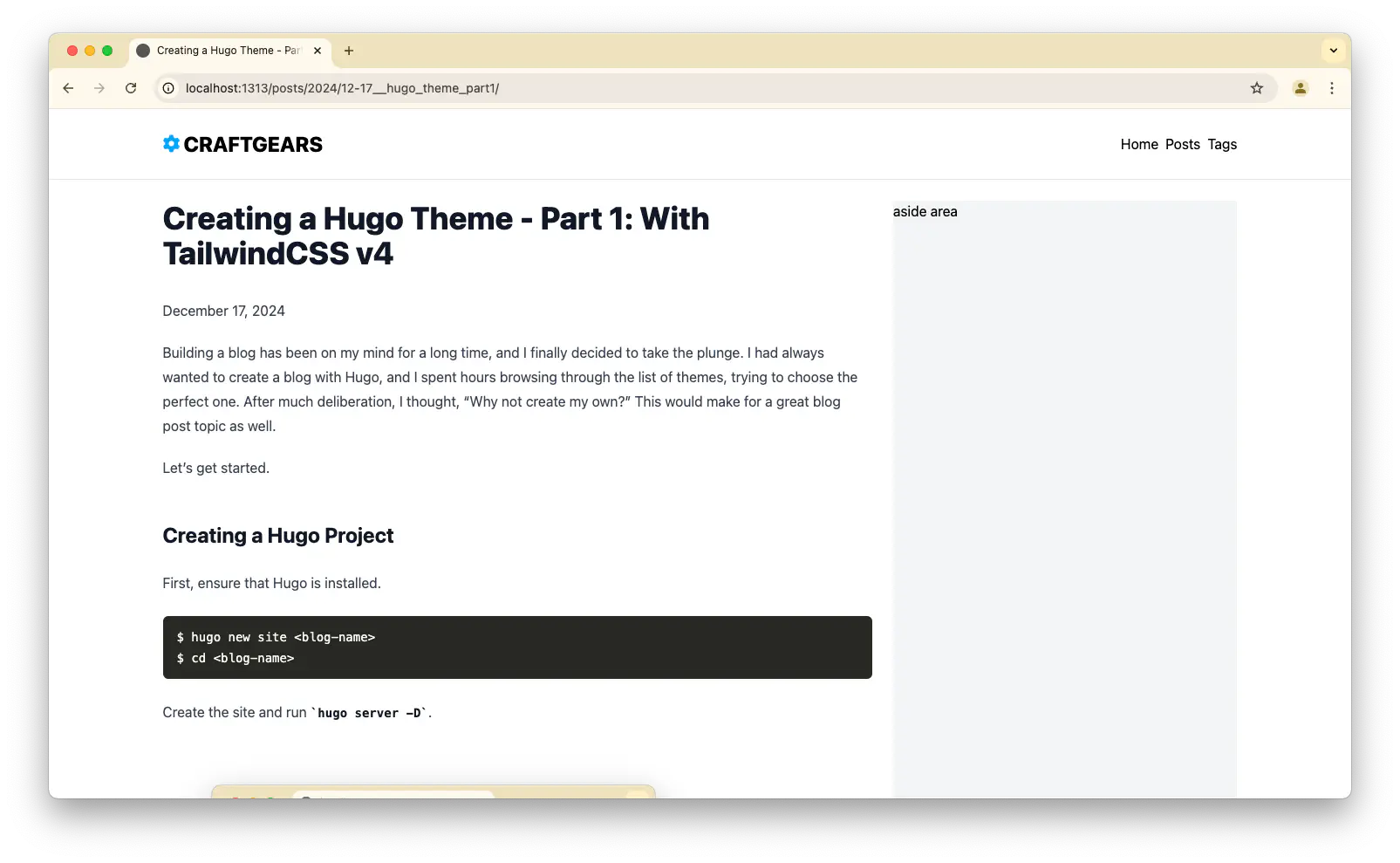
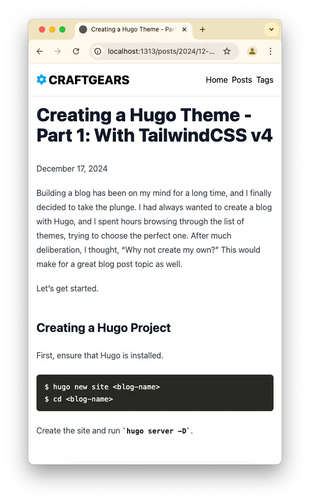
Here’s the updated themes/<theme-name>/layouts/_default/baseof.html:
<!DOCTYPE html>
<html lang="{{ site.Language.LanguageCode }}">
<head>
  {{ partial "head.html" . }}
</head>
<body>
  <header class="md:flex max-w-7xl md:mx-auto p-4 md:p-6">
    {{ partial "header.html" . }}
  </header>
  <div class="border-t border-gray-200"></div>
  <main class="md:flex md:flex-col md:max-w-7xl mx-auto p-4 md:p-6">
    {{ block "main" . }}{{ end }}
  </main>
  <footer class="flex items-center justify-center bg-gray-100 w-full h-52">
    {{ partial "footer.html" . }}
  </footer>
</body>
</html>
For the single layout, I’ve split the content into a two-column grid with an aside area:
{{ define "main" }}
<div class="grid grid-cols-1 lg:grid-cols-3 gap-6">
  <div class="col-span-2">
    <article class="prose max-w-none">
      <h1>{{ .Title }}</h1>

      {{ $dateMachine := .Date | time.Format "2006-01-02T15:04:05-07:00" }}
      {{ $dateHuman := .Date | time.Format ":date_long" }}
      <time datetime="{{ $dateMachine }}">{{ $dateHuman }}</time>

      {{ .Content }}
    </article>

    {{ partial "terms.html" (dict "taxonomy" "tags" "page" .) }}
  </div>
  <div class="bg-gray-100 w-full h-full">
    aside area
  </div>
</div>
{{ end }}
The single view is taking shape. The aside and footer can be refined later.
Conclusion #
I’ve made some changes to the Single View for viewing individual posts. There’s still a lot to be done, but I’ll tackle it step by step.
Next time, I’ll focus on improving the Home page layout!
